TikTok / Advertising systems
Designing guided campaign creation for advertisers moving from intent to launch.
A public-safe case study using advertiser-facing screenshots to show how objective selection, incentive clarity, campaign setup, creative connection, targeting, and publish moments can be organized into a legible workflow.
Public-safe framing
Use visible workflow evidence, not confidential claims.
This study intentionally avoids internal metrics, unreleased strategy, proprietary decision logic, or non-public roadmap material. The story is portfolio-readable craft: reducing setup ambiguity, making offers understandable, and helping advertisers move through a complex system with enough confidence to act.
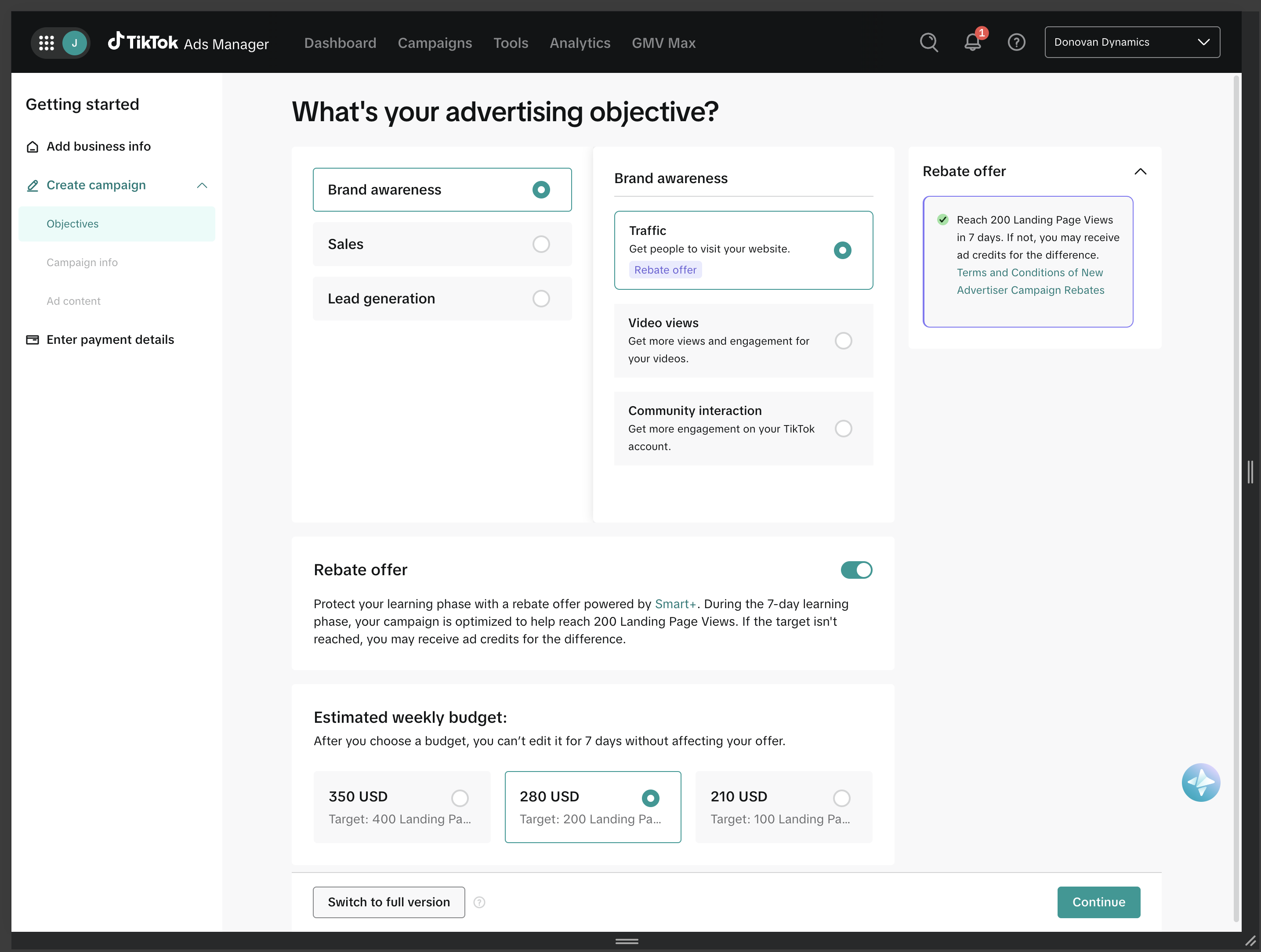
01 / Objective Selection
Campaign creation starts by turning business intent into a product decision.
The first job of the flow is not to expose every advertising control. It is to help a user name what they are trying to accomplish, understand the immediate tradeoffs, and move forward without losing the option to add sophistication later.
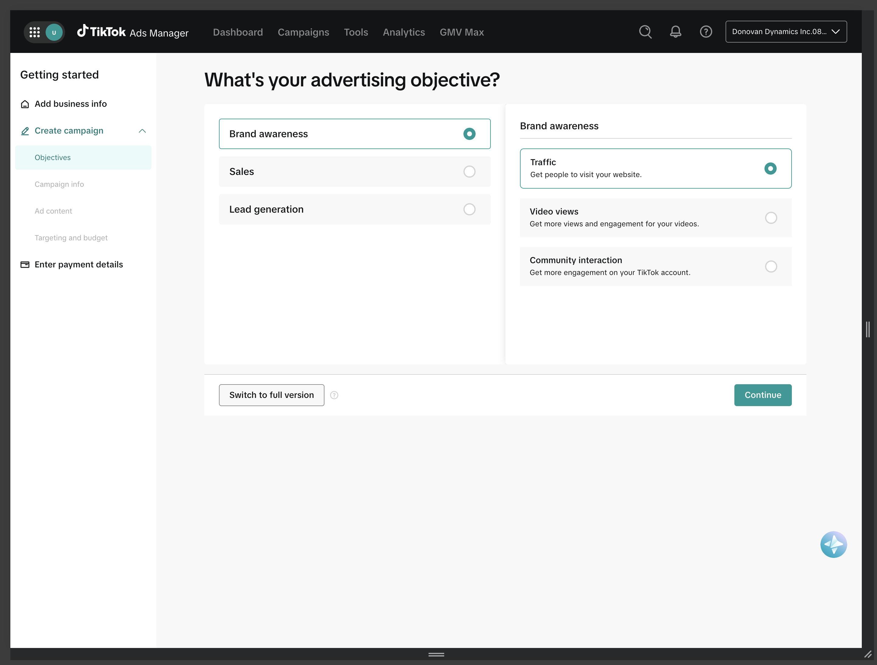
Objective categories make the system easier to enter.
The objective screen separates broad campaign goals from more specific optimization paths. That structure helps advertisers translate business language into product language before the flow asks for budget, targeting, creative, or measurement details.
Incentive information belongs near the decision it affects.
The rebate offer becomes useful when it is paired with the objective and budget choices it changes. The right rail can explain the offer while the main flow stays focused on campaign creation.
02 / Campaign Setup
The rebate offer had to become operational guidance, not decoration.
Promotional systems can easily feel bolted on. A stronger interface gives the offer a job: explain the threshold, clarify the timeline, and show what decisions help the advertiser qualify without turning the campaign form into a legal document.
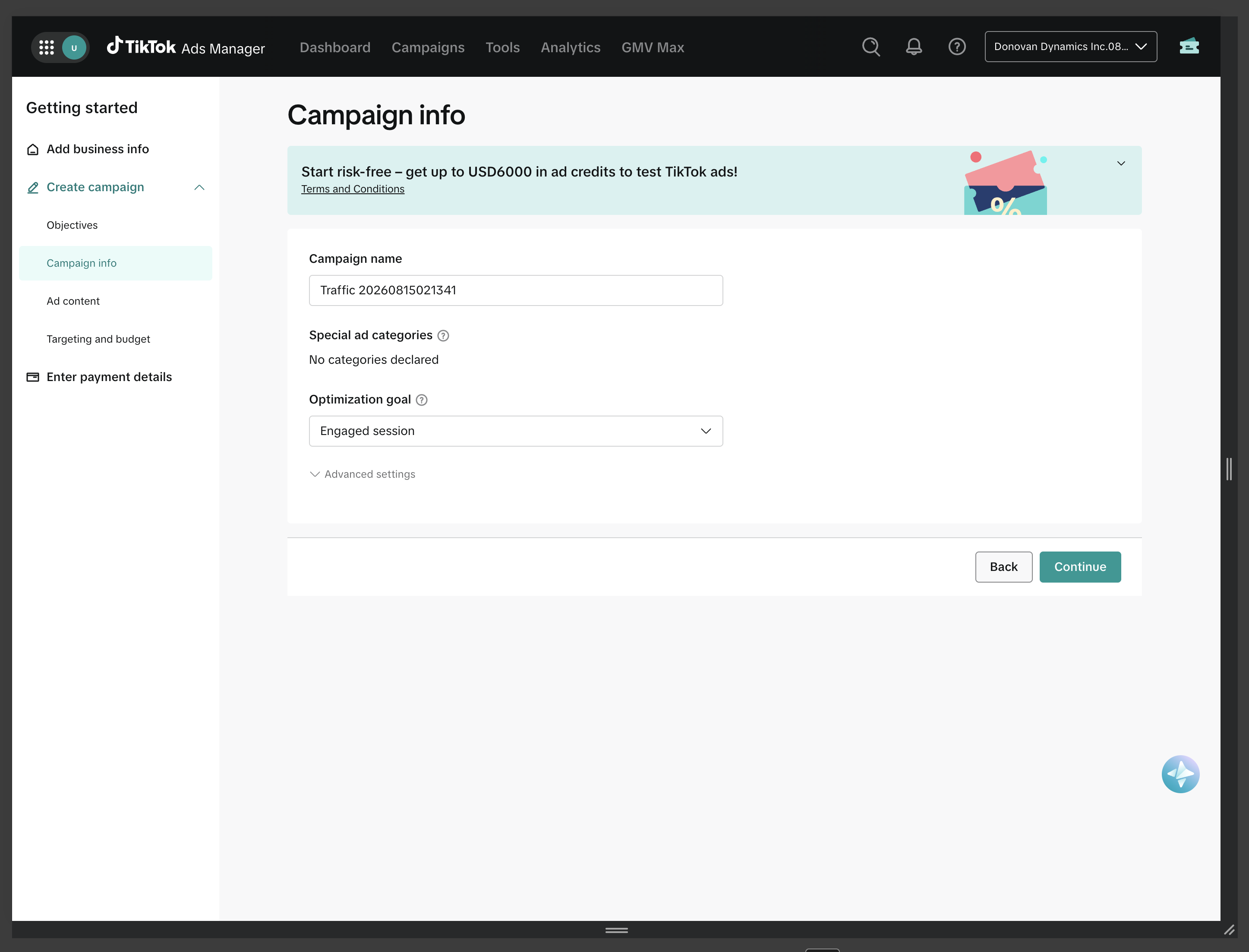
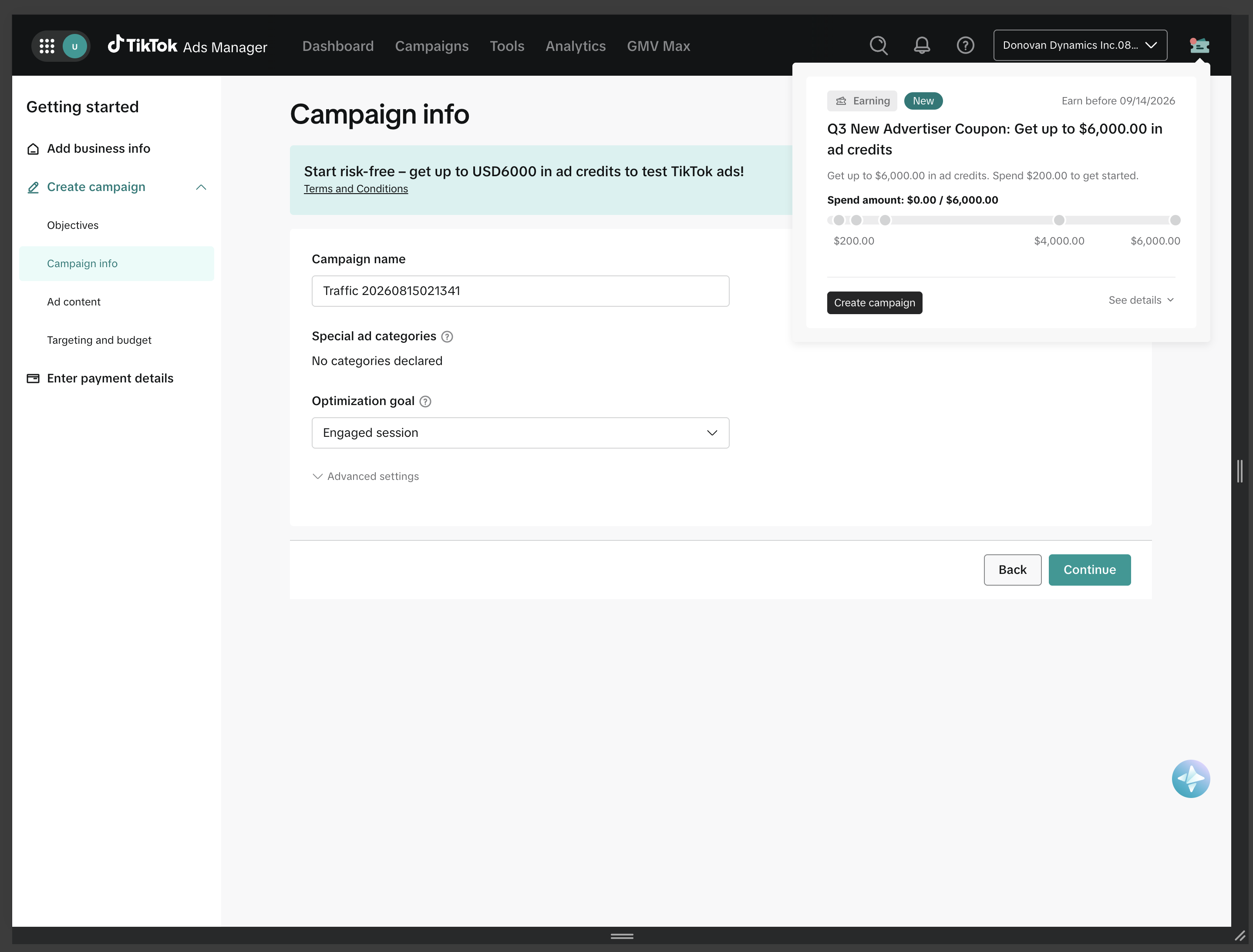
A contextual banner sets expectations before the form begins.
The campaign information step needs to preserve momentum. The banner acts as a lightweight orientation layer: visible enough to matter, compact enough to keep the form readable.
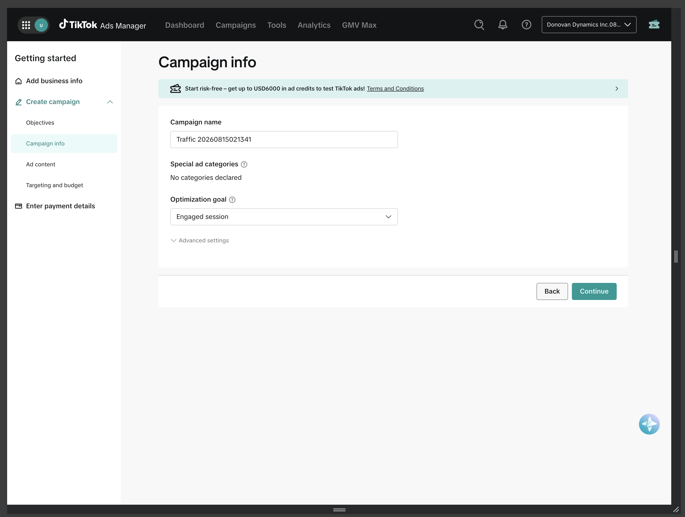
The compact version lowers visual noise while keeping the offer reachable.
Repetition can create fatigue in a multi-step setup flow. A compact banner lets the offer remain available without dominating each step, which keeps attention on the task currently being completed.
Popover detail turns a promotion into an understandable status object.
The popover exposes the offer amount, spend threshold, progress model, and next action without sending the advertiser away from setup. That is the design pattern: explain complexity at the moment of need, then return the user to the workflow.
03 / Creative, Targeting, Publish
The late-stage flow has to turn missing inputs into clear next actions.
Once the advertiser understands the goal, the work shifts from choice architecture to completion architecture: connect an account, provide a destination, add creative, choose targeting, understand terms, and publish.
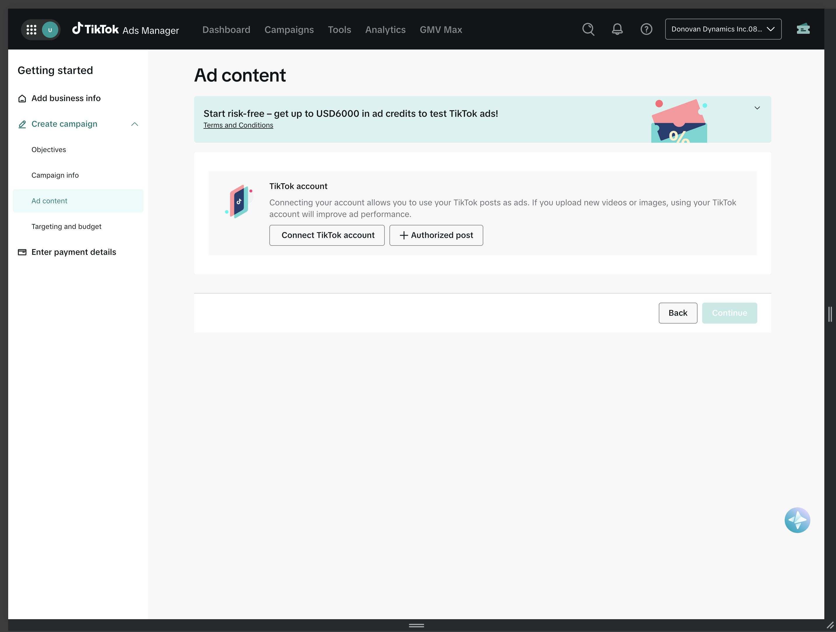
Empty states should explain what is missing and why it matters.
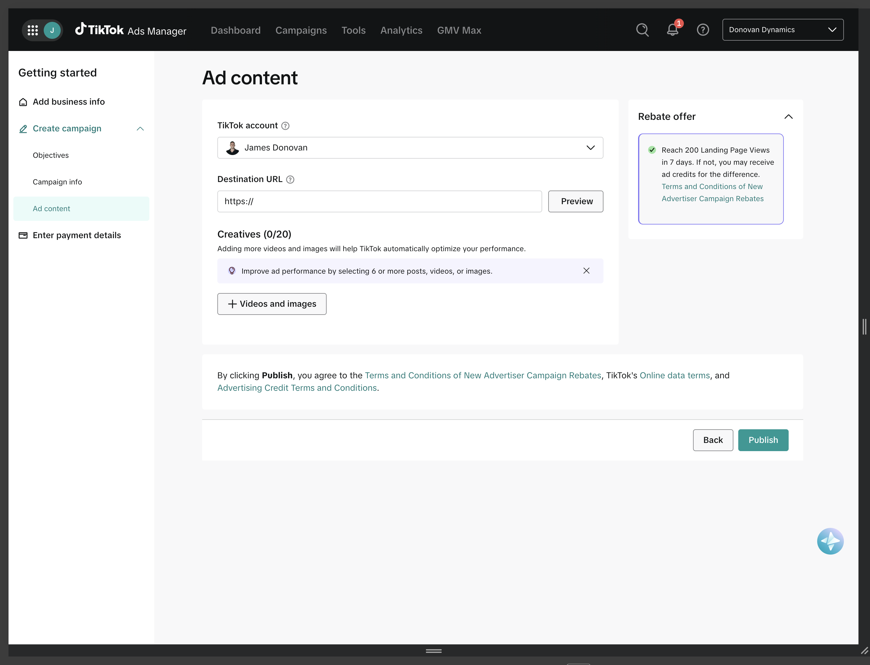
The ad content step makes account connection and authorized posts feel like setup affordances rather than errors. It also tells the advertiser how connected content can improve campaign performance in plain language.
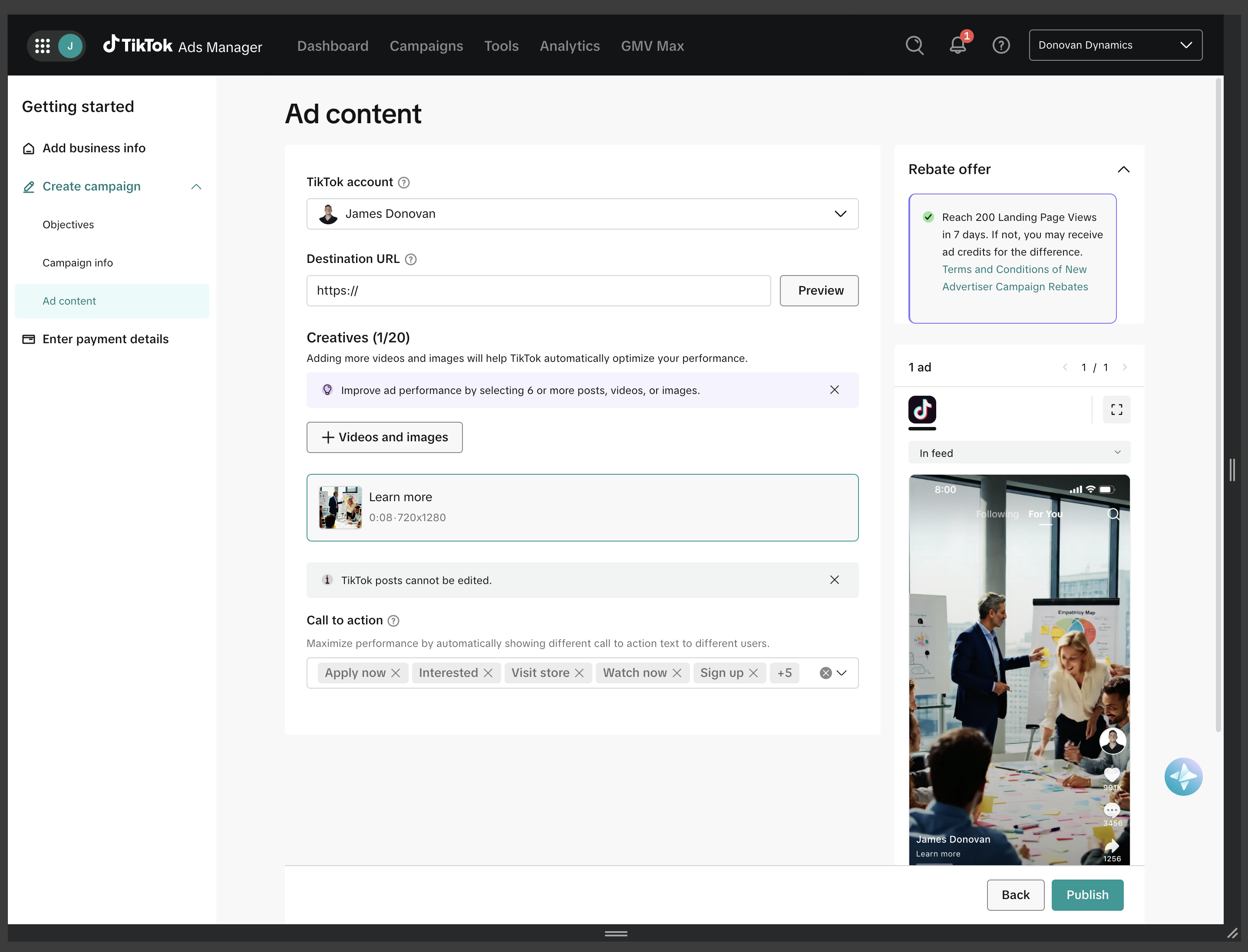
The selected ad needs to appear in the context where it will run.
Once creative is attached, the workflow shifts from setup to evaluation. The selected asset, call-to-action options, and in-feed preview help the advertiser inspect how the ad will feel before publishing.
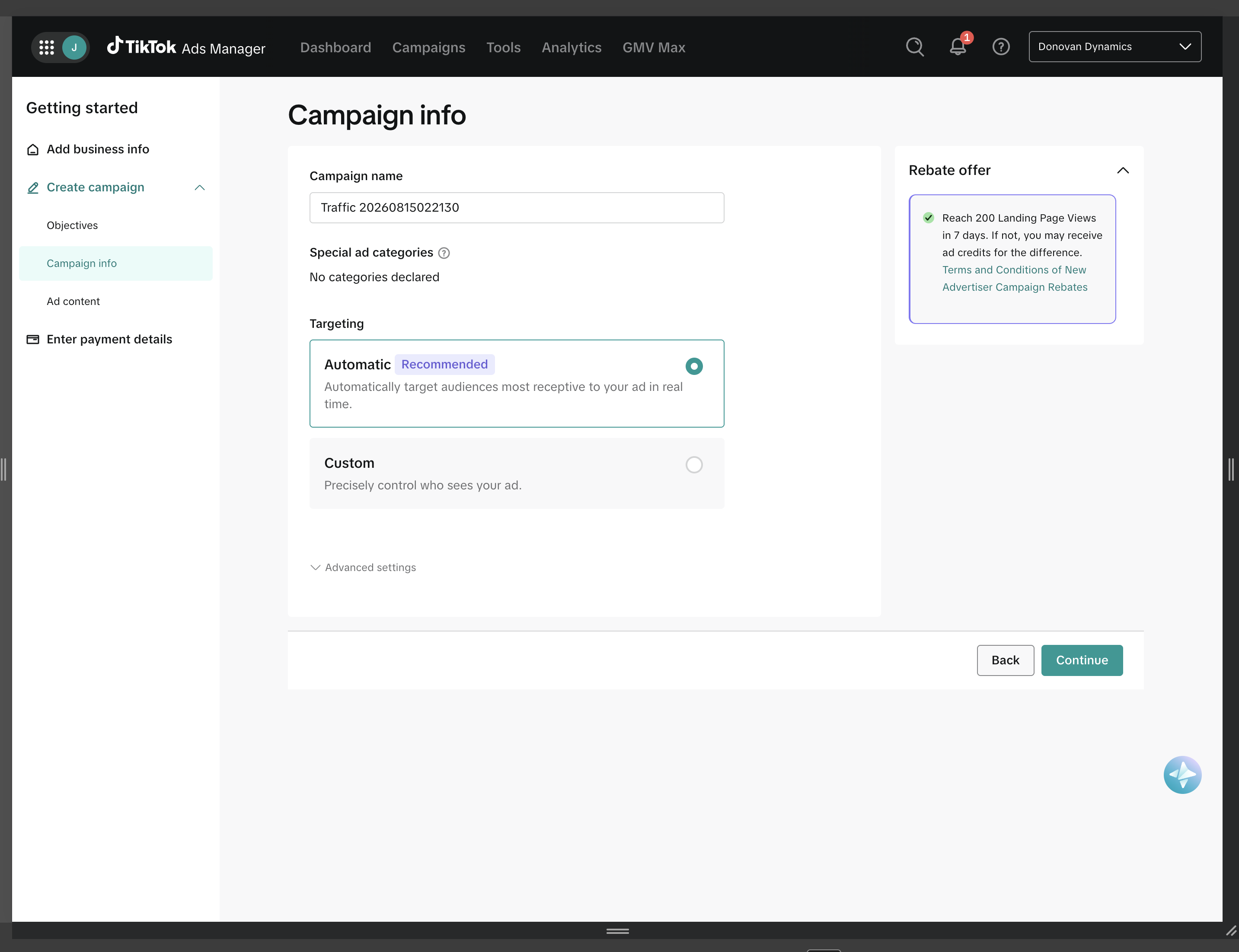
Automation needs a legible default and an escape hatch.
Automatic targeting works best when the interface explains the recommendation and leaves a clear alternative. The selection state, recommendation label, and custom option help the advertiser understand that the system is assisting rather than trapping them.
The final step has to make readiness, terms, and action feel explicit.
The publish state brings account, destination, creative, offer terms, and action together. Even when some inputs remain incomplete, the page makes the next required action visible instead of letting the user infer it from a disabled or ambiguous state.
Turn choice into sequence.
Objective, budget, offer, creative, targeting, and publish decisions are easier when the product presents them as a guided path instead of a dense configuration surface.
Place help where it changes behavior.
Incentive details are most useful near the decisions they influence: objective, threshold, spend, optimization, and publish readiness.
Make system guidance inspectable.
Recommendations, default states, and promotional mechanics become more credible when the user can inspect the reasoning, compare alternatives, and continue.
Reflection
The durable design problem is not campaign creation. It is confidence creation.
Advertisers need to understand what they are optimizing for, why a recommendation exists, what is still missing, and when they are ready to launch. The strongest workflow patterns make those states visible without exposing all system complexity at once.